
Build Your First Custom Block in ChaiBuilder
Published on Sep 6, 2026
Every visual builder has a wall. You get thirty minutes of drag and drop, then marketing asks for a mortgage calculator on the pricing page, and the wall is right there: an embed script from a third party, an iframe that does not match your fonts, or a ticket for a developer to hardcode something the editor can never touch again.
ChaiBuilder does not have that wall, because a block is just a React component you wrote plus a description of what an editor is allowed to change. Add both to the registry and your component shows up in the Add Block panel next to the built in ones, with a generated settings form and full access to the Styles panel.
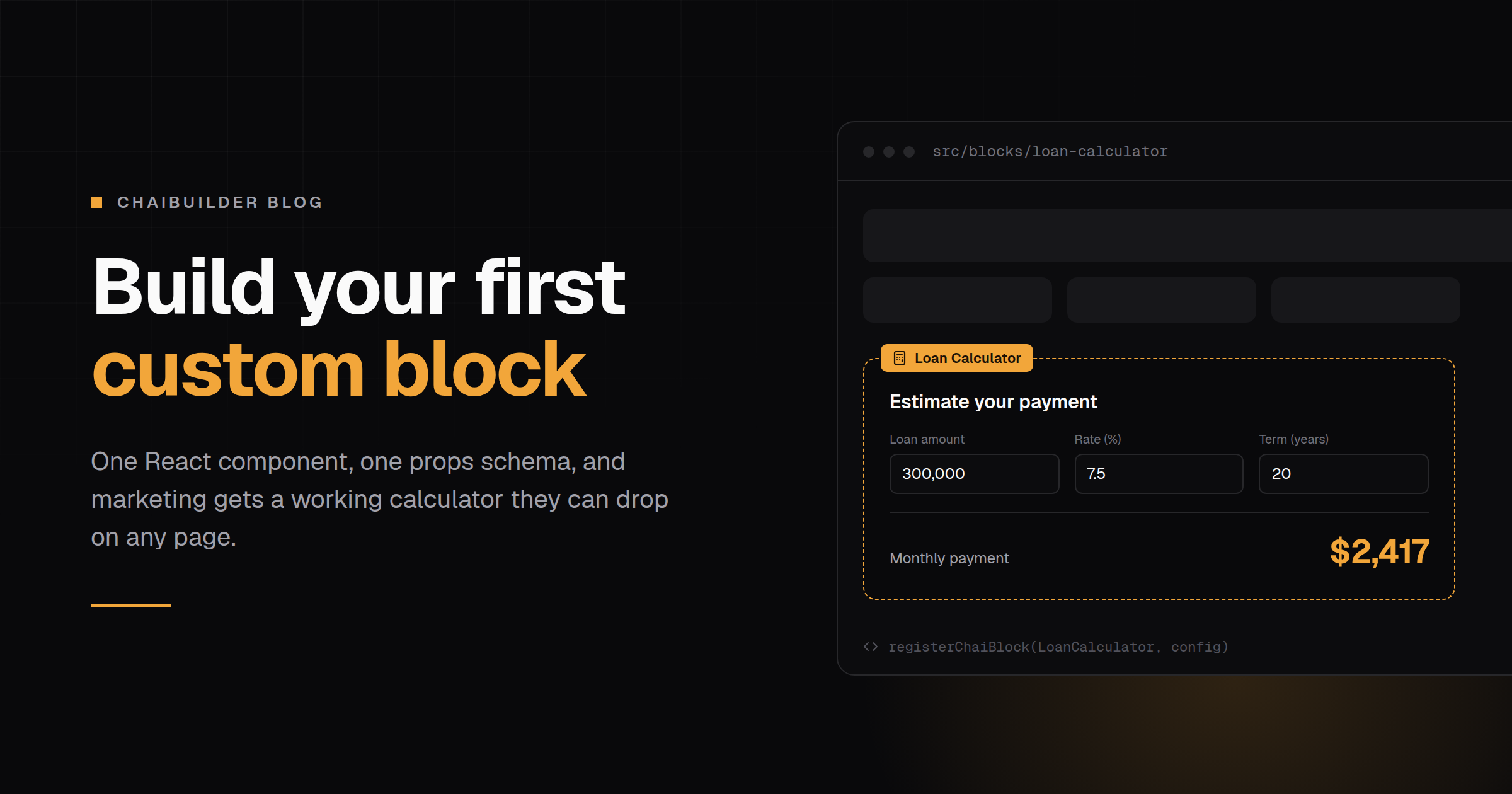
This post builds one end to end. The example is a loan calculator: three inputs, one monthly payment, small enough to read in one sitting and real enough that the interesting problems show up. By the end you will have a block an editor can drop on any page, restyle, translate, and configure without opening your codebase.
You need a running ChaiBuilder project. If you do not have one, deploy a starter or scaffold locally with npx chaibuilder-app create, then come back. The quickstart takes about five minutes.
The shape of a block
A block is two files and a line in a barrel:
src/blocks/
├── index.ts                       # registerBlocks() - the single entry point
└── loan-calculator/
    ├── component.tsx              # renders on the server
    ├── calculator-client.tsx      # "use client" leaf for the interactive part
    └── config.ts                  # type, label, props schema, behaviour
The split between component.tsx and config.ts is not stylistic. The barrel imports every config eagerly, because configs are cheap metadata the builder needs for its panels, while each component is pulled in with next/dynamic, so a page only downloads the code for the blocks it actually uses.
1. The math, and where it runs
Start with the part that has nothing to do with ChaiBuilder. The standard amortising payment formula:
// src/blocks/loan-calculator/monthly-payment.ts
export const monthlyPayment = (principal: number, annualRate: number, years: number) => {
  const months = years * 12
  if (months <= 0) return 0

  const monthlyRate = annualRate / 100 / 12
  if (monthlyRate === 0) return principal / months

  const growth = Math.pow(1 + monthlyRate, months)
  return (principal * monthlyRate * growth) / (growth - 1)
}
Now the first real decision. A registered block component renders as a React Server Component on the published page, which is what lets blocks read server data without shipping a fetch to the browser. Our calculator needs useState, so some of it has to be a client component.
The temptation is to put "use client" at the top of the block component and move on. Resist it: that pushes the whole block, heading and all, into the browser bundle. The better pattern is to keep the block component on the server and put a small client leaf underneath it.
2. The client leaf
Only the three inputs and the result need state, so only they go here.
// src/blocks/loan-calculator/calculator-client.tsx
'use client'

import { useState } from 'react'
import { monthlyPayment } from './monthly-payment'

type FieldsProps = {
  labelStyles: Record<string, string>
  inputStyles: Record<string, string>
  resultStyles: Record<string, string>
  amountLabel: string
  rateLabel: string
  termLabel: string
  resultLabel: string
  currency: string
  amount: number
  rate: number
  years: number
}

const CalculatorFields = (props: FieldsProps) => {
  const { labelStyles, inputStyles, resultStyles, currency, resultLabel } = props
  const [values, setValues] = useState({
    amount: props.amount,
    rate: props.rate,
    years: props.years,
  })

  const update = (key: 'amount' | 'rate' | 'years') => (event: React.ChangeEvent<HTMLInputElement>) =>
    setValues({ ...values, [key]: Number(event.target.value) })

  const payment = monthlyPayment(values.amount, values.rate, values.years)

  return (
    <>
      <label {...labelStyles}>
        {props.amountLabel}
        <input {...inputStyles} type="number" value={values.amount} onChange={update('amount')} />
      </label>
      <label {...labelStyles}>
        {props.rateLabel}
        <input {...inputStyles} type="number" step="0.1" value={values.rate} onChange={update('rate')} />
      </label>
      <label {...labelStyles}>
        {props.termLabel}
        <input {...inputStyles} type="number" value={values.years} onChange={update('years')} />
      </label>

      <div {...resultStyles}>
        <span>{resultLabel}</span>
        <strong>
          {currency}
          {payment.toLocaleString(undefined, { maximumFractionDigits: 0 })}
        </strong>
      </div>
    </>
  )
}

export default CalculatorFields
Two things to notice. Props are passed explicitly rather than spread through, because a server component cannot hand a function to a client child and an accidental spread is the usual cause of that error. And every visible string, including the three field labels, arrives as a prop. Hardcode "Loan amount" in the JSX and you have just built a block that cannot be translated and that no editor can reword.
3. The block component
The server half owns the outer element, the heading, and the composition.
// src/blocks/loan-calculator/component.tsx
import type { ChaiBlockComponentProps, ChaiStyles } from 'chaipro/types'
import CalculatorFields from './calculator-client'

type LoanCalculatorProps = {
  styles: ChaiStyles
  headingStyles: ChaiStyles
  labelStyles: ChaiStyles
  inputStyles: ChaiStyles
  resultStyles: ChaiStyles
  heading: string
  amountLabel: string
  rateLabel: string
  termLabel: string
  resultLabel: string
  currency: string
  amount: number
  rate: number
  years: number
}

const LoanCalculatorBlock = (props: ChaiBlockComponentProps<LoanCalculatorProps>) => {
  const { blockProps, styles, headingStyles, heading, amount, rate, years } = props

  return (
    <div {...blockProps} {...styles}>
      <h3 {...headingStyles}>{heading}</h3>
      <CalculatorFields
        key={`${amount}-${rate}-${years}`}
        labelStyles={props.labelStyles}
        inputStyles={props.inputStyles}
        resultStyles={props.resultStyles}
        amountLabel={props.amountLabel}
        rateLabel={props.rateLabel}
        termLabel={props.termLabel}
        resultLabel={props.resultLabel}
        currency={props.currency}
        amount={amount}
        rate={rate}
        years={years}
      />
    </div>
  )
}

export default LoanCalculatorBlock
blockProps carries the attributes the canvas needs to select and highlight the block, and it goes on the outermost element, exactly once. Two elements carrying it breaks selection in the editor.
The key is worth a sentence of its own. useState reads its initial value once, so when an editor changes the starting loan amount in the settings panel, the canvas would keep showing the old number and the block would look broken. Keying the leaf on the seed values remounts it when they change. Small detail, and it is the difference between an editor trusting the canvas and quietly working around it.
4. The config
This is the half that turns a component into something a non-developer can use.
// src/blocks/loan-calculator/config.ts
import { Calculator } from 'lucide-react'
import { registerChaiBlockProps, stylesProp } from 'chaipro/registry'

export const LoanCalculatorConfig = {
  type: 'LoanCalculator',
  label: 'Loan Calculator',
  group: 'advanced',
  icon: Calculator,
  description: 'An interactive monthly payment calculator with amount, rate, and term inputs.',
  canAcceptBlock: () => false,
  props: registerChaiBlockProps({
    properties: {
      styles: stylesProp('flex flex-col gap-4 rounded-lg border p-6'),
      headingStyles: stylesProp('text-lg font-semibold'),
      labelStyles: stylesProp('flex flex-col gap-1 text-sm text-muted-foreground'),
      inputStyles: stylesProp('dt#input min-w-0'),
      resultStyles: stylesProp('flex items-baseline justify-between border-t pt-4 text-xl'),

      heading: { type: 'string', title: 'Heading', default: 'Estimate your payment' },
      amountLabel: { type: 'string', title: 'Amount Label', default: 'Loan amount' },
      rateLabel: { type: 'string', title: 'Rate Label', default: 'Interest rate (%)' },
      termLabel: { type: 'string', title: 'Term Label', default: 'Term (years)' },
      resultLabel: { type: 'string', title: 'Result Label', default: 'Monthly payment' },
      currency: { type: 'string', title: 'Currency Symbol', default: '$' },

      amount: { type: 'number', title: 'Starting Amount', default: 300000 },
      rate: { type: 'number', title: 'Starting Rate', default: 7.5 },
      years: { type: 'number', title: 'Starting Term', default: 20 },
    },
  }),
  i18nProps: ['heading', 'amountLabel', 'rateLabel', 'termLabel', 'resultLabel'],
  aiProps: ['heading', 'resultLabel'],
}
Every property becomes one field in the generated settings form. title is its label, default is what a fresh instance gets, and a description on a property renders as helper text underneath. Add an enum and you get a select instead of a text field.
The stylesProp declarations are a different kind of prop. They are filtered out of the settings form and appear in the Styles panel instead, one target per declaration, which is why the block has five of them: an editor can restyle the card, the heading, the labels, the inputs, and the result row independently. Note dt#input on the input styles: that is a design token reference, so the calculator picks up the site's input styling instead of hardcoding a look that drifts the first time someone changes the theme.
i18nProps marks the text stored per language. aiProps marks what the AI assistant is allowed to rewrite, which is deliberately narrower: the assistant can improve a heading, but nobody wants it renaming "Interest rate (%)".
description is not shown on the block tile. It is context handed to the AI assistant, so write it for a reader who has to decide whether this block fits a request.
5. Register it
// src/blocks/index.ts
import dynamic from 'next/dynamic'
import { registerChaiBlock } from 'chaipro/registry'
import { LoanCalculatorConfig } from './loan-calculator/config'

const LoanCalculatorBlock = dynamic(() => import('./loan-calculator/component')) as any

export const registerBlocks = () => {
  registerChaiBlock(LoanCalculatorBlock, LoanCalculatorConfig)
}
The as any is expected. next/dynamic cannot express the block component signature, and the built in blocks do the same thing.
Then call registerBlocks() at module level in every entry that needs the registry. There is more than one, and this is the step that trips up most first blocks:
| Surface | Why it needs the registry |
|---|---|
| The builder page | Draws the Add Block panel, the settings form, and the canvas |
| The builder's action route | Resolves default props and schemas for save and AI actions |
| Every public page that renders blocks | Looks the component up by its type string |
// src/app/(site)/[[...slug]]/page.tsx
import { registerBlocks } from '@/blocks'

registerBlocks()

export default async function Page(props) { /* ... */ }
Module level, not inside a component or an effect. Registering the same type twice merges rather than throws, so this is safe and idempotent. A block that looks perfect in the builder and renders blank on the live page is almost always a missing registerBlocks() on the render entry.
6. Verify
Stop the dev server, run pnpm dev again, and walk the list:
- Loan Calculator appears in the Add Block panel under the advanced group.
- Its settings form shows the nine text and number fields with the labels you set, and none of the style props.
- The Styles panel lists five targets, one per
stylesProp. - Clicking the block in the canvas highlights it. If not,
blockPropsis on the wrong element or on more than one. - Type in the inputs inside the canvas: the payment updates.
- Publish the page, open it in a fresh browser, and confirm the classes the editor set are in the HTML.
- Check the server console for a schema error on boot. A prop name the framework owns,
childrenorlangfor example, throws there loudly rather than failing subtly later.
The gotchas that cost the most time
A missing block is usually category. The Add Block panel renders the core category and nothing else. category defaults to core, so the fix is to leave it alone. Set it to something of your own and the block is registered, renderable, and invisible.
Never put a bare className next to a spread style object. The later prop wins and silently drops everything the editor set in the Styles panel. When you need dynamic classes, merge with cn() and keep the editor's classes last:
<div {...blockProps} {...styles} className={cn(layoutClasses, styles?.className)} />Guardrail names are exact. canAcceptBlock, canBeNested, canMove, canDelete, canDuplicate. The config is a plain object, so canAcceptBlocks is not an error, it is just an unknown key that does nothing. A guardrail that "does not work" is usually a misspelt one.
The type string is permanent. Every placed instance stores it. Rename LoanCalculator later and every calculator already on a page stops resolving. Pick the name once.
Defaults are snapshots. Changing default: 7.5 next month does not update calculators already on pages. They carry the value from the day they were added.
What you actually built
Roughly a hundred lines, and the result is not a component in your codebase. It is a capability your marketing team has: they can put a working calculator on any page, restyle it to match the section it lives in, translate it, reword the labels for a different audience, and ship it without a deploy. The math stays in your repo under review, where it belongs.
That is the whole low-code argument in one file tree. The parts that need engineering judgement stay code. The parts that need to change on a Tuesday afternoon become editable.
From here, the next steps depend on what your calculator needs to grow into. Fetching live rates from your server is a data provider. A block that is really several pieces, a trigger plus a panel, is a composite. Both, plus the full config reference, are in Custom Blocks.